Tap, Order, and Pay
A web app that lets restaurant customers scan, order, and pay directly from their devices. Designed end-to-end with a clean, intuitive interface, it improves service efficiency and delivers a faster, more seamless dining experience.
Design Type
Web App
Tool
Figma
Role
UI/UX Designer
Project Overview
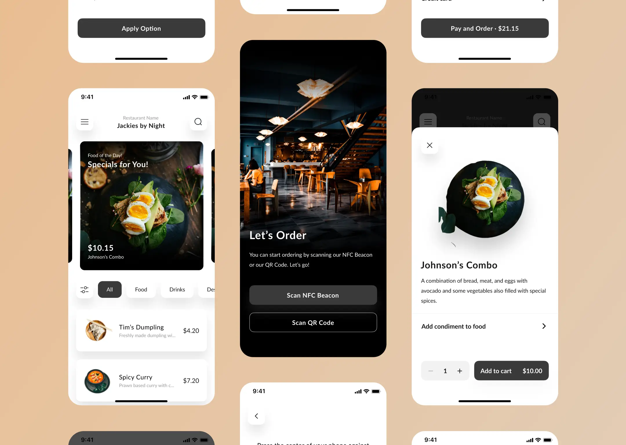
Tap, Order, Pay is a web app that helps restaurant customers order food and complete payments directly through their own devices.
The process starts by scanning a QR code or tapping an NFC beacon at the table, allowing customers to browse the menu, place their order, and pay without waiting for staff.
My Role
I was fully responsible for the UI/UX Design stage of this web app—designing the interface in Figma, creating a simple prototype, and developing a basic style guide to maintain consistency throughout the design.
Design Process
User Flow Mapping: Identifying the user journey from scanning the QR/NFC to completing the payment.
Wireframing: Building the initial structure to ensure the web app flow runs smoothly.
High-Fidelity UI Design: Developing a modern and intuitive visual interface in Figma.
Prototype: Creating a simple prototype to test core interactions.
Style Guide: Preparing a concise guide covering colors, typography, and components for design consistency.
QR & NFC Integration
The ordering journey begins the moment customers scan the QR code or tap the NFC beacon at their table. The web app instantly pulls up the correct table session, ensuring a smooth start without any manual input.
In-App Ordering
Customers can personalize their order through simple options like choosing condiments or adding notes for special requests.
Once customized, the item goes straight to the cart, keeping the ordering flow quick and straightforward without overwhelming the user.
Order Summary
Customers can review their full order before checkout, including item details and any custom requests. They can choose whether the order is prepared for take-away or delivered directly to their table.
The web app also provides multiple payment method options, ensuring the checkout process stays flexible and convenient for different customer preferences.
Credit/Debit Card Payment Flow
When customers choose to pay by card, the web app presents a clean and secure form for entering their details. Inline validation and subtle privacy cues—like masked CVV—help users feel confident while completing the process.
Once everything is filled in correctly, they can confirm their payment smoothly.
Payment Process
After reviewing their order, customers can proceed to payment and see a clear verification screen while the transaction is being processed.
Once completed, the web app confirms the order details and dining option, giving users a smooth and reassuring end to their checkout flow.
Outcome
The web app design provides a practical solution for restaurants to boost service efficiency while giving customers a fast, easy, and seamless dining experience.
This project became one of my earliest portfolio pieces. Even with its imperfections, it still feels memorable to me—maybe because it marks the stage where I started shaping my design style and learning how to turn ideas into a real, functioning experience.
What I'd Improve
Looking back, there are things I would refine, including:
- Reworking any design elements that feel too close to existing apps (my own original design).
- Refining the overall spacing, including the whitespace between menu cards.
- Replacing the note-style text field for special instructions with a set of common checkboxes customers frequently request.
- Exploring a more appealing CTA button color instead of the black #3A3A3A. Although it was a client request, I could have proposed alternative colors and explained the reasoning behind them.