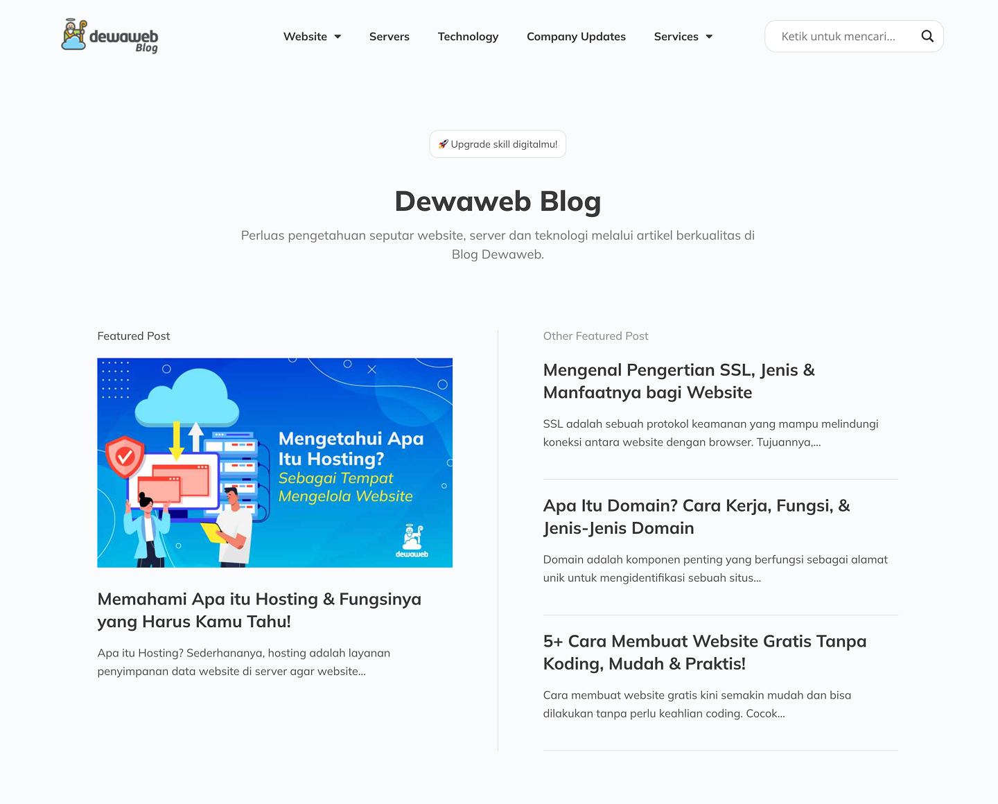
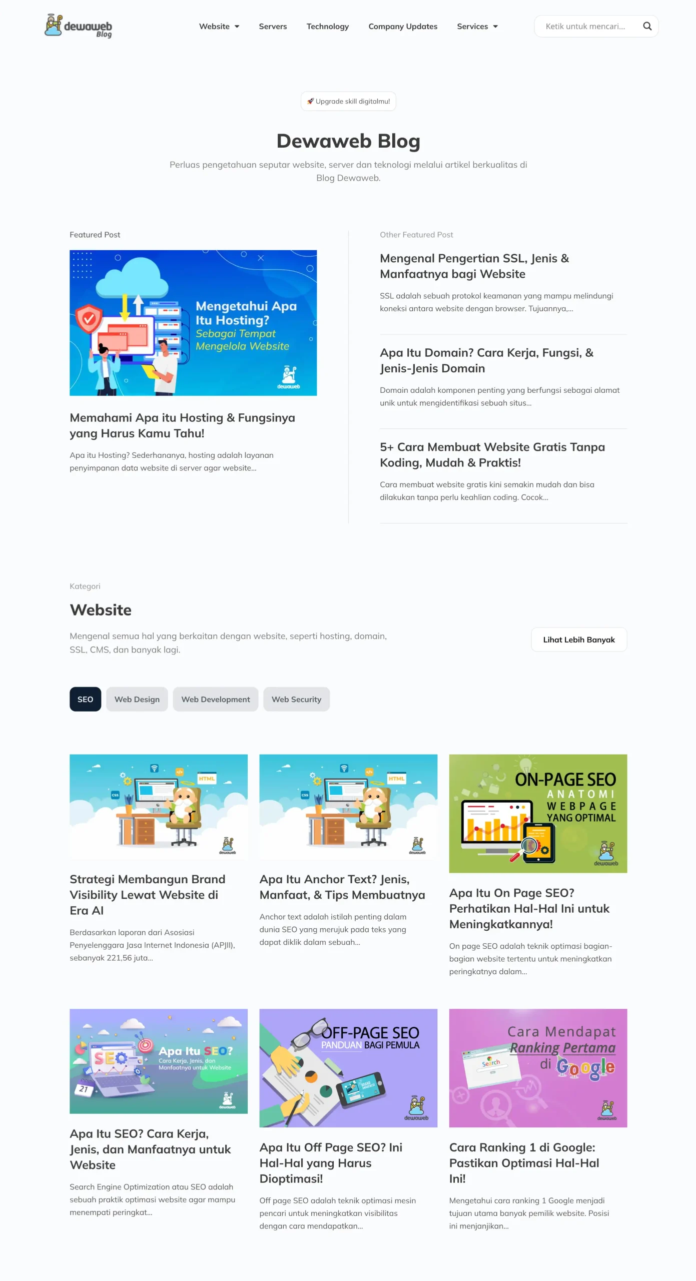
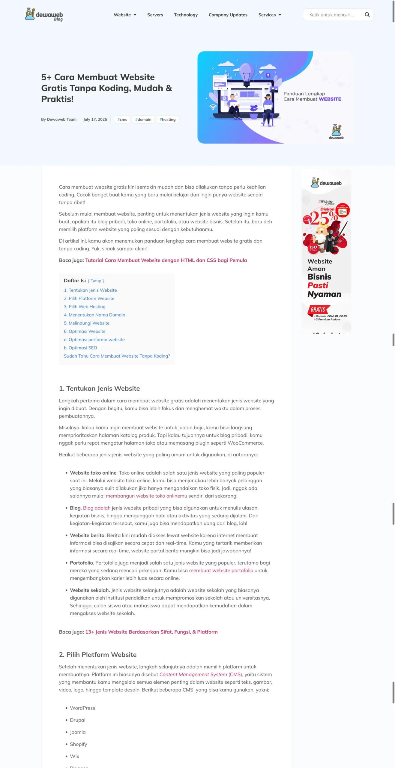
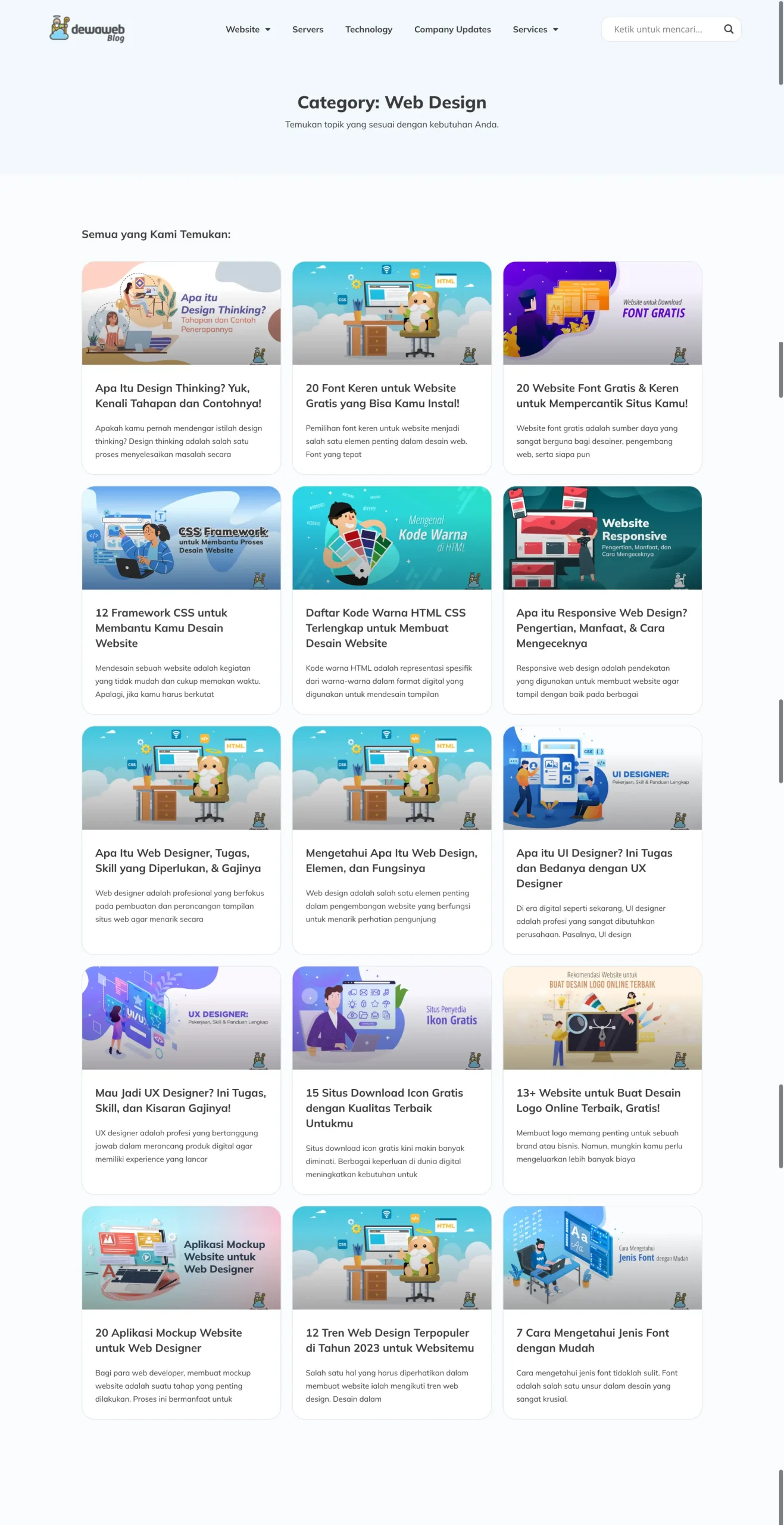
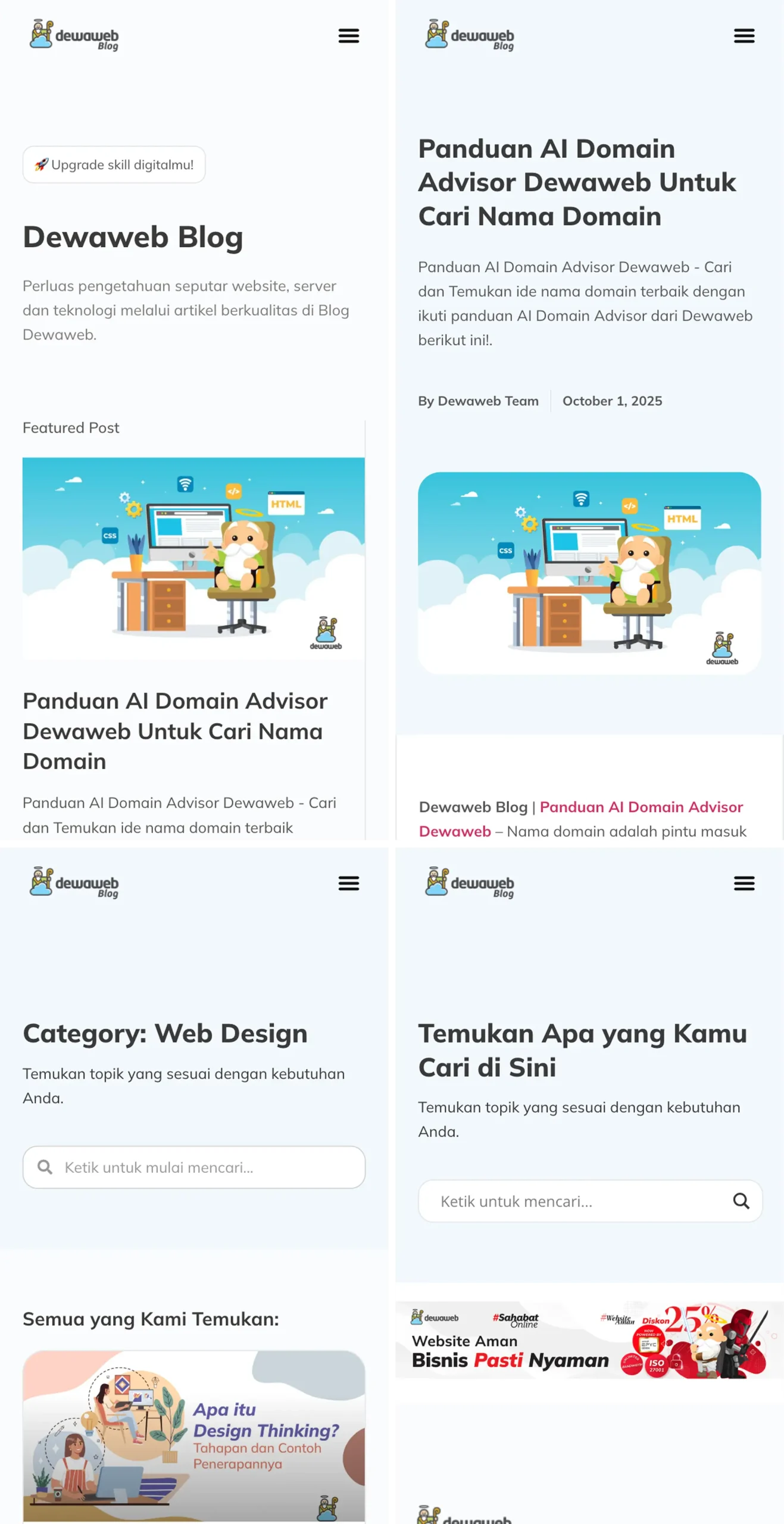
Dewaweb Blog
A revamped blog experience with cleaner structure, smoother navigation, and improved readability. Built to stay consistent with the new Dewaweb main-site revamp while making content easier to explore and enjoy.
Design Type
Website
Tools
Figma, WordPress, and Elementor
Role
UI/UX Designer | Developer
Project Overview
Dewaweb Blog is a platform focused on websites, servers, and technology. It features informative articles that help readers understand the connection between websites, servers, and technological solutions in the digital world.
My Role
I was responsible for revamping the blog’s interface using Figma before it was implemented in Elementor.
The main goal was to create a more modern, clean, and readable design to optimize the overall user experience.
Design Process
- Research & Analysis: Reviewed the old design and identified elements that could be improved in terms of UI/UX.
- Cross-Team Collaboration:I worked with the SEO team to ensure the revamp improved both visuals and performance. Their input helped refine the information hierarchy and overall content structure.
- Wireframing: Created a blog layout structure emphasizing information hierarchy and reading comfort.
- High-Fidelity Design in Figma: Developed a visual design consistent with Dewaweb’s branding, including typography, colors, and layout.
- Design Implementation: After finalizing the layout and visual direction, I developed the blog in Elementor to ensure everything matched the intended design.
Outcome
The revamped blog offers a cleaner visual system with improved spacing, clearer sections, and a layout that supports long-form reading. Content is easier to follow, and users can move between topics with less friction.
Key Improvements
- Cleaner spacing and typography for a smoother reading experience
- A more responsive and clean blog interface
- Simplified navigation to help readers find articles easily.
- Article layouts focused on readiblity and clear information hierarchy.
- Better overall layout responsiveness across devices
Try it in Action
Explore the updated layout and see how the improvements work within the final layout. This version shows the refined structure, clearer content flow, and visual updates made during the revamp.
You can also check the older version to get a clearer view of what improved and what stayed consistent.